What Gamma Should My Monitor Be? A Plain-English Answer
Table of contents
Set your monitor to gamma 2.2. That single number is the right choice for almost everyone, almost all of the time. It is the standard that Windows, macOS, the web, and most games and video are built around, so picking it means your screen shows images the way they were meant to look.
The rest of this guide explains what gamma does, the one situation where a different number makes sense, and how to check and change the setting on your own screen. If all you wanted was the number, you already have it: 2.2.
What gamma actually does
Gamma is the curve that decides how bright each shade appears between pure black and pure white. It mostly shapes the midtones and shadows, the grays that sit in the middle of an image. A signal that says “50% gray” does not come out as exactly half brightness; gamma bends that relationship so the darker tones land where your eyes expect them.
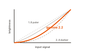
The reason this curve exists goes back to old tube televisions, which brightened unevenly by their nature. Every image and video since then has been made assuming a screen behaves that way, so today’s flat panels copy the same curve to stay compatible. Your eyes also help explain it: people notice small changes in dark tones far more than small changes in bright ones, and the gamma curve spends more of its detail down in the shadows where you can actually see it.
When the number is wrong, you can see it. Set gamma too low and the picture looks pale and flat, like a faded photo, with washed-out grays. Set it too high and shadows turn into solid black, swallowing detail you should be able to make out. A correct gamma gives an image depth and a sense of three dimensions instead of looking dull.
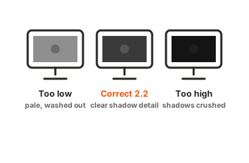
A quick example makes it concrete. Picture a night scene in a game, a dark room with a figure standing in the corner. At the right gamma you can just make out the figure against the shadows. Push gamma too high and that corner goes pure black, so the figure disappears entirely. Drop gamma too low and the whole scene turns gray and hazy, the shadows lose their weight, and the moody lighting the artists built falls apart. The number itself is invisible, but its effect on what you can and cannot see is not.
When should you use 2.4 instead?
Use 2.4 for watching movies in a fully dark room, and stick with 2.2 for everything else. That is the whole rule in one line. Gamma 2.4 makes the picture darker and punchier, with deeper shadows, which suits cinema-style viewing when no other light is competing with the screen.
The choice comes down to the light around you, not personal taste. In a dark room your pupils open wide and you become very sensitive to shadow detail, so a darker curve looks rich and correct. Add some light to the room and things flip. Ambient light bounces off the screen and lifts the blacks, so the same 2.4 setting now buries shadow detail and the picture reads as muddy. Lowering the curve to 2.2 brightens the shadows just enough to cancel out the room’s glare, and the image ends up looking the way it should.
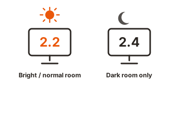
This is why a desk in a lit office or a living room with a window should stay on 2.2 for daily use. Gamma 2.4 belongs to a specific setup: films, in the dark, with the lights off. For desktop work, browsing, and gaming under normal lighting, 2.4 usually does more harm than good.
You may also spot other values in your menu, like 1.8, 2.0, or even 2.6. Treat them as special cases, not everyday picks. Lower numbers such as 1.8 or 2.0 lift the shadows and can help if you use the screen in bright sunlight and just need to see the picture, at the cost of a flatter, paler look. Higher numbers like 2.6 tie to digital cinema projection and look very dark and saturated on a normal desk. None of these is a general-purpose choice; they exist for particular rooms and particular content, and 2.2 remains the one to default to.
The best gamma for gaming, photos, and video
For nearly every everyday use, the answer stays 2.2. Here is how that plays out across the things people actually do on a monitor.
Gaming
Set your monitor to 2.2 and adjust from there inside the game. Games are made and tested on 2.2 screens, so that gives you the picture the developers intended, with a fair balance of dark-scene visibility and shadow detail. If a game has its own brightness or gamma slider, use that for fine-tuning rather than changing the monitor, since the in-game control stacks on top of your hardware setting. Competitive players sometimes raise brightness to spot enemies hiding in shadows, but treat that as a tactical tweak, not an accurate picture.
Photo editing
Photographers should be on 2.2, no exceptions. Standard image files assume it, so if your screen is off you will “fix” a photo to look right on your monitor and then publish something that looks wrong to everyone else. If you edit seriously, a hardware calibration tool (a small sensor that sits on the screen) will lock your display far more precisely than eyeballing it ever can.
Movies and video
Use 2.2 for casual watching, and switch to 2.4 only in a dark room for a more cinematic look. Streaming and disc content is generally graded on 2.4 in a dark mastering suite, which is exactly why 2.4 pays off when your own room matches those conditions and falls apart when it does not.
Office work and text
Stay near 2.2 and set your brightness to suit the room. That combination keeps text readable, whites under control, and the gray panels in menus cleanly separated. A quick way to catch a bad setup on a two-screen desk: drag a plain gray window from one monitor to the other. If one looks noticeably smokier or denser than the other, their gamma does not match.
The Mac 1.8 rule is out of date
If you have read that Macs should use gamma 1.8, ignore it. That advice stopped being correct in 2009. Apple switched the Mac default from 1.8 to 2.2 with Mac OS X 10.6 Snow Leopard, and every version of macOS since has stayed on 2.2.
The old 1.8 value dated back to the early days of Mac computers and black-and-white laser printing, long before the web ran on the sRGB standard. Sticking with it today makes photos and web pages look pale and washed out compared to how the rest of the world sees them. Whether you are on a Mac or a Windows PC, 2.2 is the number, and a modern Mac already uses it out of the box.
What about HDR?
When you turn on HDR, the gamma setting stops applying. HDR does not use gamma at all. It uses a different system, usually one called PQ, that maps the signal to exact brightness levels measured in nits instead of following a gamma curve. So the 2.2 versus 2.4 question simply has no place in HDR mode, and you will often find the gamma control grayed out while HDR is switched on.
There is one practical wrinkle worth knowing on Windows. When you enable HDR, older standard-range content like the desktop, many games, and web pages can look faded, with grays where deep blacks should be. This happens because Windows uses a slightly different tone curve for that content than the gamma 2.2 curve those apps were built for. The short version: gamma is an SDR (standard dynamic range) setting. Leave HDR off for everyday desktop use so your 2.2 gamma applies, and turn it on only for real HDR movies and games, where the screen handles the brightness curve for you. Microsoft documents the washed-out-HDR behavior and the fix on its own Windows HDR support thread.
How to check your monitor’s gamma
The fastest free way to check gamma is a visual test pattern you view in your browser. Load the Lagom LCD gamma test, then sit back from the screen and squint or blur your eyes a little. Each column has thin stripes that blend into a solid tone at a certain point; the number printed where they blend is your gamma. If the stripes merge at the mark labeled 2.2, your monitor is tracking the standard.
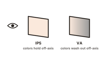
A few things make the reading more reliable. Let the monitor warm up for 20 to 30 minutes first, since panels shift slightly when cold. Look at the screen straight on, not from an angle, because many panels change gamma noticeably as your viewing angle changes. And run the screen at its native resolution with any image zoom set to 100%.
These squint-and-match tests are handy for a rough check, but they are not precise. For real accuracy, especially for photo or video work, a hardware sensor that measures the screen directly is the only dependable option.
How to change your gamma setting
You can change gamma in two places: on the monitor itself, or in your computer’s software. The monitor’s own menu is the better option when it offers gamma, because those adjustments happen inside the display and do not reduce color quality.
On the monitor (best option)
Press the physical buttons or the small joystick on your monitor to open its on-screen menu, then look for a picture or color section. Many monitors list gamma choices such as 1.8, 2.0, 2.2, and 2.4, or sometimes only vague labels like Gamma1, Gamma2, and Gamma3. If yours shows numbers, pick 2.2. If it only shows labels, set each one in turn and use the test above to see which lands on 2.2. Also switch off any “dynamic contrast” or “eco” mode first, since those constantly shift the picture and will fight your setting.
On your computer (fallback)
If your monitor has no gamma control, adjust it in software. On Windows, search for “Calibrate display color” in the Start menu to open the built-in wizard, which walks you through a gamma step. On a Mac, go to System Settings, then Displays, then Color, and open the calibration option. Software calibration works by adjusting the graphics card rather than the panel, which can very slightly reduce the number of shades on screen, so it is a fine fallback but a second choice behind a proper monitor control.
Whichever route you take, change the setting in the lighting you normally use. Correct gamma can look too dark in a bright room or too bright in a dark one, so calibrating in your real conditions gives you a result that actually looks right where you sit.
Conclusion
Set your monitor to gamma 2.2 and you are done for almost everything: Windows, Mac, the web, games, and photo work all expect it. Reach for 2.4 only when you are watching movies in a fully dark room, and remember that HDR ignores gamma entirely. Check your setting with a quick on-screen test, adjust it in your monitor’s menu when you can, and calibrate in your normal room light. A good result looks natural, with clear shadows and no washed-out or crushed tones.
For more on getting your picture dialed in, browse our monitor specs guides.
Frequently asked questions
Is 2.2 or 2.4 gamma better?
For most people, 2.2 is better because it matches computers, the web, and games and suits normal room lighting. Choose 2.4 only for watching movies in a fully dark room, where its deeper shadows and higher contrast look more cinematic.
What gamma should I use for gaming?
Use 2.2, since games are built and tested on it. If a game has its own brightness or gamma slider, tune that instead of your monitor. Some players raise brightness to spot enemies in shadows, but that trades accuracy for an edge.
Does a higher gamma value make the screen brighter?
No, it is the opposite. A higher gamma like 2.4 makes midtones and shadows darker and the image more contrasty. A lower gamma like 2.0 lifts the shadows and makes the picture look paler and flatter.
What gamma should my Mac be set to?
Set it to 2.2. Macs have defaulted to 2.2 since 2009, so a modern Mac already uses it. The old advice to use 1.8 is outdated and will make photos and web pages look washed out.
Why does my screen look washed out when I turn on HDR?
HDR does not use your gamma setting, and on Windows the standard-range content curve can raise black levels, giving a faded look. Keep HDR off for desktop use and turn it on only for true HDR movies and games.