27 Inch 5K Monitor for Graphic Design: Is It Big Enough?
Table of contents
Yes, a 27 inch 5K monitor is big enough for most graphic design work. Its 5120 by 2880 panel packs about 218 pixels per inch, and at 200 percent scaling it gives you the same amount of workspace as a 27 inch 1440p screen, only far sharper. It starts to feel tight if you run many panels at once or lay out large formats, and that is when a 32 inch screen or a second display earns its place.
What 5K at 27 inches actually gives you
Resolution on its own says little. What your eyes respond to is pixel density, and what your workflow responds to is how much room the interface leaves for the canvas. A 27 inch 5K screen scores well on both, as long as you understand how scaling turns physical pixels into usable space.
Pixel density
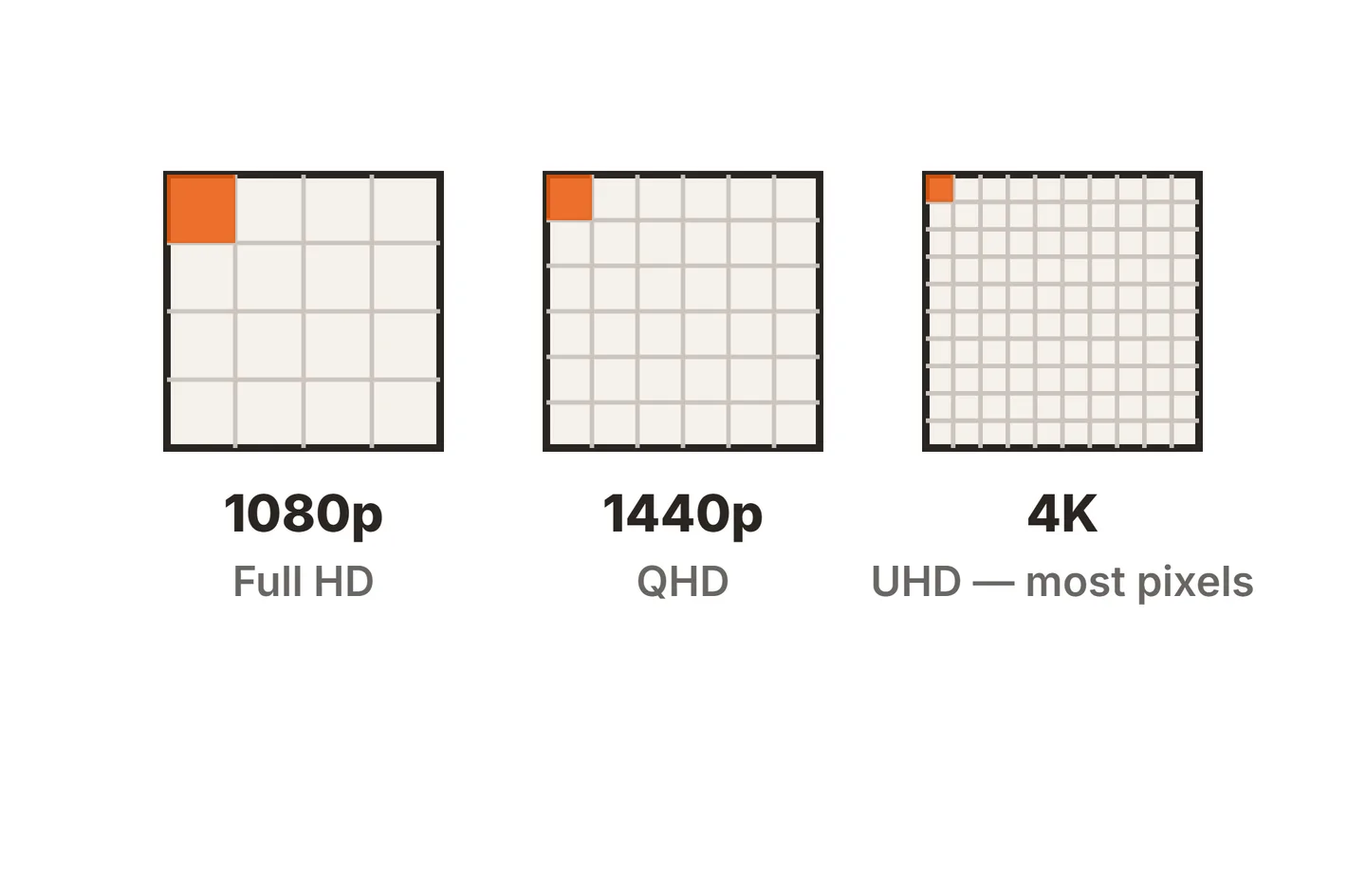
At 27 inches, 5K lands at about 218 PPI. For comparison, 27 inch 4K is about 163 PPI and 27 inch 1440p is about 109 PPI. At a typical desk distance of 20 to 30 inches, 218 PPI is dense enough that you stop seeing individual pixels, so kerning, hairlines and small icons look the way they will print. Our guide to 4K vs 1080p monitors explains why density, not resolution alone, is the number to watch.

Workspace at 200 percent
Run a 5K panel at 100 percent and everything is far too small to use. The standard setting is 200 percent, which draws every interface element with a 2 by 2 block of pixels. The result looks like a 2560 by 1440 desktop in size, the same room you get on a 27 inch 1440p monitor. That fits a full page in InDesign or a large Illustrator artboard with toolbars and panels around it.
27 inch 5K vs 27 inch 4K vs 32 inch 4K and 6K
These are the four screens most designers end up comparing. The workspace column shows the default scaling most people use.
| Monitor | Pixel density | Typical scaling | Looks like | Best fit |
|---|---|---|---|---|
| 27 inch 1440p | About 109 PPI | 100% | 2560 x 1440 | Budget design, visible pixels |
| 27 inch 4K | About 163 PPI | 150% (Windows) | 2560 x 1440 | Windows designers, good value |
| 27 inch 5K | About 218 PPI | 200% | 2560 x 1440 | Mac designers, sharpest at 27 |
| 32 inch 4K | About 138 PPI | 125% to 150% | About 2560 x 1440 to 3072 x 1728 | More room, softer text |
| 32 inch 6K | About 218 to 220 PPI | 200% | About 3000 x 1700 | Room and sharpness, high cost |
The pattern is simple. At 27 inches, 4K and 5K give you the same usable space, and 5K is the sharper of the two. At 32 inches, 4K gives you more room but lower density, while 6K matches the density of 27 inch 5K and adds about 40 percent more screen area. If you are unsure how much bigger a 32 inch screen really is, our breakdown of how wide a 27 inch monitor is puts the two side by side in inches and centimeters.
macOS vs Windows scaling
The operating system you design on changes the answer more than most spec sheets admit.
On a Mac
macOS draws its interface at exactly 1x or 2x. When you pick a size that is not exactly half the panel’s resolution, it renders the desktop at 2x a larger size and then shrinks the result to fit the panel. On a 27 inch 4K screen set to look like 2560 by 1440, that means drawing 5120 by 2880 and squeezing it into 3840 by 2160. It works, but fine lines and small type can look a touch soft, and it costs some graphics performance. Apple’s guide to changing your Mac display’s resolution shows where these options live.
A 27 inch 5K panel avoids this entirely. Its default 2x mode looks like 2560 by 1440 with no resampling, which is why 5K at 27 inches has become the classic Mac design setup.
On Windows
Windows supports fractional scaling such as 125 and 150 percent natively, and modern apps redraw themselves at those settings. That makes 27 inch 4K at 150 percent a very good design screen on a PC. Older desktop software that was never updated for high density screens can still look blurry, as Microsoft’s high DPI documentation explains. 5K still looks a little crisper on Windows, but the gap is smaller than on a Mac.
Color matters more than the extra pixels
Sharpness is easy to see in a store. Color accuracy is what decides whether your client’s brand red prints correctly. Before you pay for 5K, check these:
- Gamut coverage. Full sRGB is the minimum for web work. Wide gamut coverage such as Display P3 or a large share of Adobe RGB helps with photo and print work.
- Panel type. IPS panels hold their colors at an angle, which matters on a wide screen you view from one spot.
- Uniformity. Brightness and tint should be even from corner to corner, or large flat fills will look patchy.
- Calibration. Factory calibration helps, but a hardware colorimeter keeps the screen honest as it ages. Our guide on how to calibrate a monitor covers the basic steps.

Our walkthrough of a monitor color accuracy test covers how to check a new screen and what Delta E numbers mean. A calibrated 4K panel will serve you better than an uncalibrated 5K one.
When to go bigger or add a second screen
A 27 inch 5K screen stops being enough in a few clear situations (and if you are worried about the opposite problem, see whether a 27 inch monitor is too big for your desk):
- Panel-heavy apps. If layers, properties, swatches and a timeline all need to stay open, the canvas shrinks fast at 2560 by 1440.
- Large formats. Posters, packaging dielines and multi-page spreads benefit from the extra width of 32 inches.
- Reference work. If you constantly flip between a brief, a browser and your file, a second screen saves more time than a bigger primary.
A common pro setup is a 27 inch 5K main screen with a cheaper second monitor beside it for palettes, email and reference. Our look at what size monitor pros use covers how working setups tend to balance size and count, and our setup guides explain how to arrange two screens comfortably.
Conclusion
For most graphic designers, a 27 inch 5K monitor is big enough and is one of the sharpest options at this size. You get a 1440p-sized workspace with about 218 PPI, clean 2x scaling on a Mac and type that looks close to print. Choose 27 inch 4K instead on Windows or a tighter budget, and step up to 32 inches or a second screen when your panels crowd the canvas. Whatever you pick, put color accuracy and calibration first.
For more on reading a spec sheet, browse our monitor specs guides or start from our monitor knowledge base.
Frequently asked questions
Is 5K worth it over 4K for graphic design?
On a 27 inch screen, often yes, especially on a Mac. 5K at 200 percent gives a sharp 2560 by 1440 workspace with no fractional scaling, while 4K must either look like 1080p or use a scaled mode that renders slightly softer. On Windows the gap is smaller.
What scaling should I use on a 27 inch 5K monitor?
Start at 200 percent, the usual macOS default for these screens, which gives a workspace that looks like 2560 by 1440. If you want more room and have good eyesight, a scaled setting that looks like about 2880 by 1620 works, at a small cost in sharpness.
Is 27 inches too small for print and layout work?
Not for most jobs. A 27 inch screen shows a full A4 or US Letter page near actual size with panels around it. Large format layouts, multi-page spreads and dense tool palettes are where designers usually start wanting a 32 inch screen or a second display.
Do I need to calibrate a 5K monitor for design?
If your work goes to print or to clients who judge color, yes. Factory calibration is a good starting point, but panels drift over time. A hardware colorimeter and a regular schedule, such as monthly, keep what you see close to what others will see.