How to Calibrate Monitor Brightness, Contrast and Color
Table of contents
To calibrate a monitor, set its brightness with a black-level test pattern, set contrast with a white-level pattern, then pick a 6500K (D65) white point and gamma 2.2 in the monitor menu. Windows and macOS include free wizards that walk you through the same steps by eye. For photo editing or print work, a hardware colorimeter measures the screen and builds an exact correction profile.
This guide takes you through all three routes in order, from free by-eye adjustments to a full measured calibration.
Before you start
Calibration is only as good as the conditions you do it in. A few minutes of preparation saves you from repeating the whole job.
- Warm up the screen. LCD backlights change slightly in brightness and color while they settle, so give the monitor around 30 minutes.
- Use your normal lighting. Calibrate in the room light you usually work in, and keep direct sun and reflections off the screen.
- Reset the picture mode. Pick Standard, sRGB or Custom. Vivid, Game and Cinema presets deliberately push color and contrast. Model guides such as our MSI MAG 321URX color settings name the best starting mode for a specific screen.
- Turn off automatic features. Dynamic contrast such as DCR or the ACM monitor setting on Acer screens, ambient light sensors, eco modes and night-light filters all change the image while you work.
- Run native resolution. Scaling softens fine test patterns and makes them harder to read.
How to calibrate a monitor by eye
The by-eye method uses simple test patterns and your monitor’s own menu. It is free and fixes the most common problems: crushed shadows, clipped highlights and an obvious color cast.
Set brightness with a black-level pattern
Open a black-level test that shows dark gray squares or bars on a black background. Lower brightness until the darkest patches disappear, then raise it until they are only just visible. Black should still look black, not gray.Set contrast with a white-level pattern
Open a white-level pattern with near-white patches on a white background. Raise contrast until the patches start to merge into the background, then step back down until each one is distinct again. That point keeps highlights bright without clipping.Choose the white point
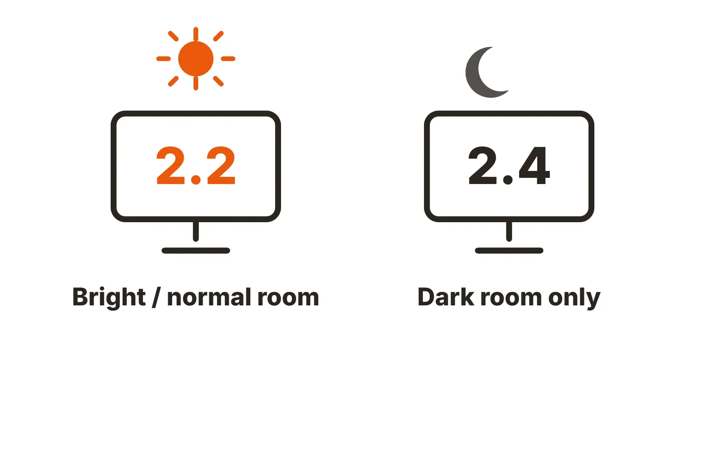
In the monitor’s color temperature setting, pick 6500K, sometimes labeled D65, Normal or sRGB. This is the white calibration that matters most: white should look like clean paper, not blue or yellow.Set gamma to 2.2
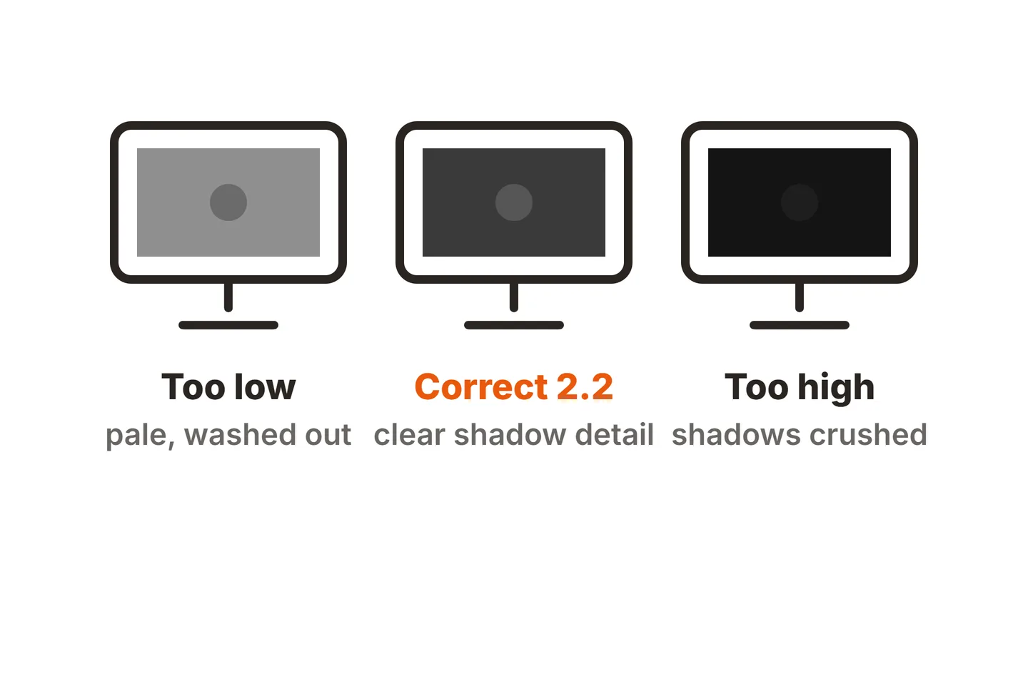
If the menu offers gamma, choose 2.2 or the mode that matches it. Gamma controls how dark the midtones look, and 2.2 is the standard for Windows, macOS and the web.Recheck black and white
Changing the white point and gamma can shift the ends of the range, so run the black-level and white-level patterns once more and make small corrections.
If your monitor has RGB gain sliders and white still looks tinted at 6500K, nudge the dominant color down a step or two at a time. Our guide to PC monitor gamma explains how to read a gamma test pattern in more detail. Keep the steps small, because pushing the sliders hard can make smooth gradients show banding.
Use the built-in Windows and macOS tools
Both operating systems include a guided calibration that writes a color profile for your display. It still relies on your eyes, but it adds reference images and saves the result.
Windows: Calibrate display color
Microsoft’s display color settings guide explains where the tool lives. In Windows 11, open Settings, then System, Display and Color profile, and select Calibrate display. You can also search the Start menu for “Calibrate display color” or run dccw.
- Adjust gamma until the small dots in the center of the circles fade into the background.
- Set brightness and contrast using the reference images, with the monitor’s own buttons.
- Balance color by moving the red, green and blue sliders until gray bars look neutral.
- Compare the new and previous calibration, then save it as a new profile.
macOS: Display Calibrator Assistant
Apple’s Display Calibrator Assistant guide covers the Mac version. Open System Settings, then Displays, choose the Color profile menu, select Customize and click Add. The assistant walks you through the adjustments and saves a calibrated profile. Apple notes that most Macs do not need this in a normal home or office.
Calibrating a monitor for photo editing
Photo editing raises the stakes, because your edits will be seen on other screens and in print. Three targets matter most.
| Setting | Everyday and web | Photo editing for print |
|---|---|---|
| Color space | sRGB | sRGB, or Adobe RGB / Display P3 on a wide-gamut screen |
| White point | 6500K (D65) | 6500K (D65) as a default |
| Gamma | 2.2 | 2.2 |
| Luminance | Comfortable for your room | About 80 to 120 cd/m2 in a dim room |
| Method | By eye or OS wizard | Colorimeter |
Color space. sRGB is the standard for the web and most screens, so it is the safe target for anything shared online. Wide-gamut monitors can show more of Adobe RGB or Display P3 (see DCI-P3 vs sRGB), which helps when editing for high-end print or HDR, but only if your software is color managed.
Luminance. A range of roughly 80 to 120 cd/m2 in a dim room is a common target because it keeps the screen from glowing far brighter than paper. It is a range, not a rule: a brighter room needs a brighter screen, and the real goal is a screen that matches your prints under your lighting.
Consistency. Keep room lighting the same every time you edit, since your perception of the screen shifts with the light around it.
When a colorimeter is worth it
Your eyes are good at spotting relative differences and poor at judging absolute color, because they adapt to whatever white is in front of them. A colorimeter calibration removes that guesswork.
A colorimeter is worth buying if you:
- Edit photos for print or for clients.
- Grade video or work with brand colors.
- Need several monitors to match side by side.
For gaming, office work and movies, the by-eye method and OS wizard are usually enough.

What the colorimeter workflow looks like
- Install the software that comes with the device, or a free open-source tool such as DisplayCAL.
- Set your targets: white point, gamma and luminance.
- Hang the sensor on the screen and adjust the monitor’s brightness and RGB controls as the software guides you.
- Let the software measure a series of color patches, which usually takes a few minutes or longer.
- Save the resulting ICC profile. The International Color Consortium maintains the profile format that operating systems and editing apps use to correct color.
Once you have calibrated, the next step is checking the result. Our monitor color accuracy test guide shows how to verify it with free patterns and Delta E measurements.
Conclusion
Calibrating a monitor comes down to four settings: brightness for black level, contrast for white level, a 6500K white point and gamma 2.2. You can get close for free with test patterns and the Windows or macOS wizard. For photo editing, a colorimeter turns those targets into a measured profile. For more step-by-step guides, browse our monitor setup guides, the monitor specs section, or the rest of the SubInsider monitor knowledge base.
Frequently asked questions
Can you calibrate a monitor without a colorimeter?
Yes, up to a point. Black-level and white-level patterns let you set brightness and contrast well by eye, and the Windows and macOS wizards help with gamma and color balance. What you cannot do by eye is hit an exact white point or luminance, because your vision adapts to whatever white it sees.
What color temperature should I calibrate my monitor to?
6500K, also called D65, is the standard white point for sRGB, the web, Windows and most photo and video work. It looks neutral rather than blue or yellow. Some print workflows use a warmer white to match paper under specific lighting, but 6500K is the right starting point for nearly everyone.
What brightness is best for photo editing?
Many photographers aim for roughly 80 to 120 cd/m2 in a dim room, which keeps the screen from looking much brighter than a print. There is no single correct value, because the right level depends on your room lighting. Pick a value in that range and keep your lighting consistent.
How often should I calibrate my monitor?
For casual use, once after setup is usually enough, plus a quick recheck if the picture starts to look off. For photo editing or print work, recalibrate every few months with a colorimeter, because backlights shift in brightness and color slightly as they age.