PC Monitor Gamma: What It Is and What to Set It To
Table of contents
Gamma is the curve that decides how bright each signal level looks on screen, and on a PC monitor you want it set to 2.2. That value matches the sRGB standard, which is what Windows, the web, and almost every game and photo are built around. Get it wrong and shadows either turn to mud or wash out into grey, no matter how good the panel is. Here is what the number means, how to check yours, and where to change it.
What gamma actually controls
Gamma describes the relationship between the signal your PC sends and the light your monitor gives back. It follows a simple power curve, y = x to the power of gamma, where x is the input level and y is the light that comes out.
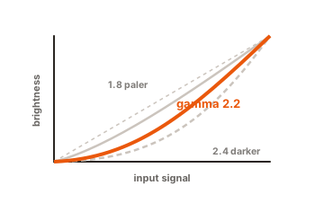
At a gamma of 2.2, a signal sitting halfway between black and white does not come out at half brightness. It comes out at about 22 percent. That sounds wrong until you remember that human vision is not linear either. We are far more sensitive to changes in dark tones than bright ones, so the curve spends most of its precision down where your eyes are looking.
Gamma is not the same thing as brightness. Brightness sets the overall light output, usually by driving the backlight. Gamma decides how the levels between black and white are spread out inside that range. Turning brightness up on a screen with low gamma makes it lighter and just as flat.
The visible result splits neatly in two:
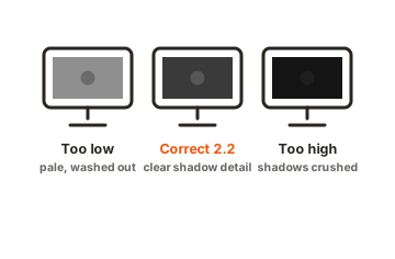
- Gamma too low. Midtones lift, shadows go grey, and everything looks flat and slightly foggy. Dark scenes lose their punch.
- Gamma too high. Midtones drop, contrast looks strong at first glance, and detail disappears in the shadows. Dark game corners turn into solid black.
What to set PC monitor gamma to
Use 2.2 unless you have a specific reason not to. It is the value Windows assumes, the value built into sRGB, and the value nearly every LCD and OLED panel is designed around.
| Gamma | How it looks | When to use it |
|---|---|---|
| 1.8 | Bright, low contrast, lifted shadows | Legacy Mac and print work only |
| 2.0 | Slightly lifted midtones | Very bright rooms, or if shadow detail matters more than depth |
| 2.2 | The reference | Desktop, web, gaming, photo editing, almost everything |
| 2.4 | Deeper midtones, stronger contrast | Film and TV content in a dark room |
The 1.8 figure is a leftover from print. Mac OS used it as the default until Snow Leopard moved to 2.2 in 2009, and it now only makes sense when you are looking at something authored for it.
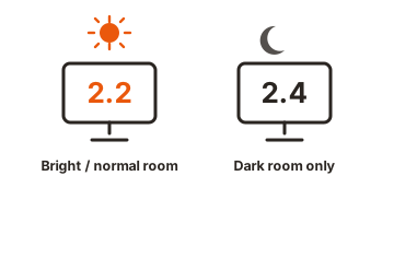
The case for 2.4 is real but narrow. It comes from broadcast and cinema standards, which assume a dim viewing room. In a lit office it looks heavy and buries shadow detail. Room lighting genuinely changes what reads as correct, so a screen calibrated to 2.2 in a dark room can feel a little dark at midday next to a window.
How to check your gamma in two minutes
You do not need a colorimeter to spot a problem. A gamma test image shows striped patterns next to solid grey blocks, labelled with gamma values. Sit back from the screen or squint, and read off the point where the stripes and the block blend together.
Two rules make the test valid. Run the image at your monitor’s native resolution with no scaling in the browser or image viewer, and turn off any dynamic contrast or picture enhancement mode in the monitor menu first. Both will skew the result.
The Lagom gamma calibration test checks three separate brightness levels rather than one, which matters because monitors rarely behave the same across the whole range. On a true sRGB display the bands blend at 2.25 at 48 percent brightness, 2.20 at 25 percent, and 2.17 at 10 percent. Reading around 2.2 at the top level and drifting a little at the others is normal and fine.
Where to change it
Work through these in order, because each step after the first costs you something.
-
The monitor menu
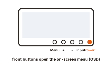
Look under Picture, Image or Colour for a Gamma entry. Some monitors name the options directly (1.8, 2.0, 2.2, 2.4) and others use Gamma 1, Gamma 2, Gamma 3, or Mode 1 and Mode 2. This is the best place to change it, because the monitor does the work in its own high precision internal table and nothing is lost on the way. -
Windows Display Colour Calibration
Search the Start menu for “Calibrate display colour”, or run dccw. The wizard walks you through a gamma slider with a target image. It is quick and free, and it is done by eye, so treat it as a rough correction rather than a calibration. -
A colorimeter
A hardware probe with software such as DisplayCAL or the tool bundled with the device measures the actual curve and builds an ICC profile with a correction table. This is the only option that gives you a number rather than an impression.
Avoid pulling gamma around in the graphics driver if the monitor can do the job. Driver-side correction reshapes an 8-bit signal, which throws away levels and can leave visible banding in gradients. The monitor’s own gamma control does not have that problem.
Why your gamma never sits exactly on 2.2
Panels do not have a clean power curve to begin with. The native response of an LCD tends to wander, often in an S shape, and the red, green and blue channels can drift apart from each other, which shows up as tone jumps and slight colour casts in dark and bright areas. Better monitors fix this internally with a 10-bit, 12-bit or even 14-bit look-up table, remapping the incoming 8-bit signal onto a smoother curve. EIZO’s write-up on monitor gamma covers how that internal correction works.
There is also a wrinkle in the standard itself. The sRGB specification is not a plain 2.2 power curve. It uses a short straight section near black and an exponent of 2.4 above that, which averages out close to 2.2 but is not identical to it. That is why a monitor’s sRGB preset can measure slightly off 2.2 and still be correct.
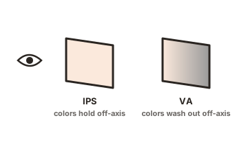
Panel type matters too. On VA and TN screens, gamma shifts as your head moves, so the same image reads differently at the edges of a large screen than it does in the centre. IPS and OLED hold much steadier.
Gamma and HDR
The gamma setting applies to standard dynamic range content only. HDR10 uses a different transfer function called PQ, standardised as SMPTE ST 2084, which maps each signal level to an absolute brightness in nits rather than a share of whatever the display can manage. Because those values are fixed, there is nothing for a gamma control to adjust, and most monitors grey the setting out once HDR is running.
So set gamma for your SDR desktop and games, and handle HDR separately with the Windows HDR Calibration app or your monitor’s own HDR modes.
Conclusion
Set your monitor to gamma 2.2, check it with a test image at native resolution, and change it in the monitor menu rather than the graphics driver. If shadows look flat, gamma is low; if dark detail vanishes, it is high. That single setting does more for how a screen looks than most of the other picture controls put together, and it takes a couple of minutes to get right.
For more, see our monitor specs guides.
Frequently asked questions
What is the best gamma setting for a PC monitor?
2.2 for nearly all use. It matches sRGB, which Windows, browsers and games assume. Use 2.4 only for film in a dark room, and 1.8 only for older Mac and print content.
Is higher or lower gamma better for gaming?
Neither. 2.2 is correct for gaming. Lowering gamma to see into dark corners lifts the whole image and flattens it, which is what a black equaliser setting does more selectively.
Does gamma affect brightness?
Not the overall light output, which is set by the brightness control. Gamma changes how the tones between black and white are distributed, so a screen can look dim or washed out at the same brightness level.
Why does my monitor look different from my friend's at the same gamma?
The label on the setting is a target, not a measurement. Panel behaviour, contrast setting, room lighting and viewing angle all shift the real curve, which is why measured gamma varies between two units of the same model.
Do I need to calibrate gamma with hardware?
Only for colour-critical work. For general use, the monitor's 2.2 preset checked against a test image is close enough. A colorimeter is worth it if you edit photos or video for print or client delivery.