Computer Monitors for Visually Impaired Users: What Actually Helps
Table of contents
If you have low vision, the right monitor can make reading, typing, and video calls feel easy again instead of a daily fight. The best choice is a large screen (24 to 32 inches), with a matte anti-glare finish, a flicker-free backlight, a wide brightness range, and a stand you can raise, tilt, and pull close. Pair that screen with the free magnifier already built into Windows and Mac, and you have most of what you need.
You don’t have to buy a special “low vision monitor” to get there. A good mainstream monitor with the right features often works just as well, for a lot less money. Here is how to pick one.
What makes a monitor good for low vision?
A good low-vision monitor shows large, sharp text that stays clear when you enlarge it, without glare or flicker to tire your eyes. Screen size, resolution, finish, brightness, and the stand all feed into that. Get those five right and the screen works with your eyes instead of against them.
Here is a quick view of what matters and why:
| Feature | What to look for | Why it matters |
|---|---|---|
| Screen size | 24 to 32 inches for a desk | Bigger text stays sharp without heavy zoom |
| Resolution | 1080p at 24 in, 1440p at 27 in | Text looks crisp, not blocky, when enlarged |
| Finish | Matte (anti-glare) | Cuts reflections that wash out the screen |
| Brightness | Wide range, dims low and lifts high | Match the room morning or night |
| Backlight | Flicker-free / DC dimming | Less eye strain over long sessions |
| Stand | Height, tilt, and VESA mount | Sit closer and set the right angle |
The rest of this guide walks through each of these in plain terms, then covers the free software and setup that turn a good screen into a genuinely comfortable one.
How big should the screen be?
For most people with low vision, a 24 to 32 inch monitor hits the sweet spot at a normal desk. A bigger screen gives you more room to enlarge text while still seeing a full sentence or a whole email at once, so you scroll and pan less.
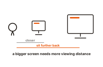
Size and viewing distance work together. A 24 inch screen suits a small desk where you sit close. A 27 inch is a comfortable all-rounder. A 32 inch gives real breathing room if you have space and sit a little further back. Going much bigger than 32 inches on a desk can backfire: your head has to swing to follow lines of text, and the edges drift out of your clearest vision.
Ultrawide and strongly curved monitors look tempting, but they ask your eyes to scan a long way left to right. If you have side (peripheral) vision loss, that extra width can slow you down. A standard 16:9 screen is the safer starting point unless you already know a wide layout suits you.
If you’re not sure what size feels right, there’s a cheap way to test before you buy. Open a document on any screen you already own, bump the text up to a size you can read comfortably, and see how much of a line fits without scrolling sideways. If you’re losing the end of every sentence, you want a bigger screen or a lower zoom level. That quick check tells you more than any spec sheet.
Resolution: why sharper text helps
Resolution is the number of tiny dots (pixels) that build the picture. More pixels mean smoother edges on letters, so text stays clean instead of turning blocky when you make it bigger. That matters a lot when you rely on large fonts or a magnifier.
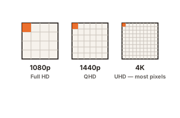
You don’t need the highest number on the shelf. Match the resolution to the screen size:
- 24 inch: 1920 x 1080 (Full HD) is plenty and easy on your computer.
- 27 inch: 2560 x 1440 (also called 1440p or QHD) gives noticeably crisper text.
- 32 inch: 1440p works; 4K looks sharper but only if you turn up scaling.
One trap to avoid: a very high resolution like 4K on a small screen makes everything tiny by default. That is the opposite of what you want. It’s fixable in settings by turning up the display scaling (more on that below), but if you’d rather not fiddle, a 1080p or 1440p screen gives you big, clear text with no extra steps.
There’s a second reason resolution matters for low vision. When you use a magnifier, the computer stretches the pixels that are already on screen to make them bigger. Start with more pixels and the enlarged text keeps smoother edges for longer before it starts to look jagged. So a sharper screen doesn’t just help at normal size, it also holds up better once you zoom in, which is exactly when you need it most.
Matte or glossy? And why flicker matters
Choose a matte screen. A matte (anti-glare) finish has a fine coating that scatters reflections, so windows and overhead lights don’t bounce off the surface and wash out what you’re reading. Glare is harder on low vision than on typical eyesight, so cutting it is one of the biggest comfort wins you can get.
Glossy screens can look punchy in a showroom, but at home they mirror every lamp and window behind you. In a bright room, a matte screen is the clear pick.
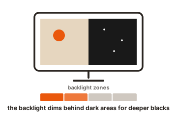
Brightness range matters too. Look for a monitor that dims low for evening use and climbs high for a sunny room. The goal is to keep the screen roughly as bright as the space around it, so your eyes aren’t jumping between a glowing screen and a dim wall.
Then there’s flicker. Many screens dim by switching the backlight on and off very fast, faster than most people consciously notice, but it can still cause headaches and tired eyes over a long day. Screens described as flicker-free or using DC dimming avoid this. It’s a small line on the spec sheet that makes a real difference if you spend hours reading.
The stand: getting close and comfortable
An adjustable stand is easy to overlook and genuinely important. With low vision you often want to sit closer than usual, tilt the screen to kill a reflection, or raise it so the top line sits just below eye level. A stand that moves lets you do all of that.
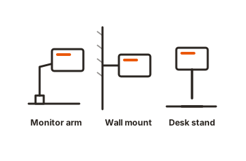
Look for height adjustment and tilt at a minimum. Even better, check that the monitor has a VESA mount, a set of standard screw holes on the back that fit a swing arm. A cheap monitor arm lets you pull the screen right up to you and push it back when you’re done, which is hard to do with a fixed stand.
Set the top of the screen at or just below eye level, and angle it so you look slightly down. That reduces strain and helps you sit close without craning.
Free software that does the heavy lifting
Before you spend anything on special software, try the magnifier already built into your computer. It’s free, it’s always there, and for many people it does the whole job. Windows and Mac both include one.
On Windows, press the Windows key and the plus sign to open Magnifier. You can zoom the whole screen, use a movable lens, or dock a magnified strip at the top. You’ll find the settings under Accessibility. Microsoft explains the options on its Windows accessibility page.
On a Mac, the same feature is called Zoom. Turn it on under System Settings, then Accessibility, then Zoom, where you can also enlarge the pointer, invert colours, or add a colour filter to make text stand out. Apple lists these under its accessibility features for vision.
Both systems also let you make text bigger everywhere without a magnifier, using display scaling. On Windows it’s in Display settings; on Mac it’s under Displays. Turning scaling up to 125, 150, or 175 percent enlarges menus, icons, and text across the whole computer, which is often all a mild vision loss needs.
It’s worth spending an afternoon learning the free magnifier’s modes. Full-screen zoom enlarges everything and is good for reading; lens mode magnifies a small area that follows your cursor, handy for spot-checking a price or a menu; docked mode keeps a magnified strip pinned to one edge while the rest of the screen stays normal size. Different tasks suit different modes, and switching between them becomes second nature quickly.
If the built-in tools aren’t enough, paid software like ZoomText adds sharper magnified text, smoother tracking, and stronger colour controls. It’s worth it for some, especially at work where you move fast between apps, but treat it as a step up once you’ve outgrown the free options, not a first purchase. Many people never need it.
Setting up the monitor so it actually helps
A great monitor still needs a few minutes of setup to suit your eyes. Do these in order and adjust to taste:
-
Set the screen to its native resolution
Use the resolution the monitor was built for (the highest one listed). Anything lower makes text fuzzy. -
Turn up display scaling
Raise text size to 125, 150, or more until it’s comfortable, rather than dropping the resolution. -
Match brightness to the room
The screen shouldn’t glow much brighter or dimmer than the space around it. -
Position it
Top of the screen at or below eye level, tilted so no lamp or window reflects into it, pulled as close as you like. -
Try colour tweaks
Higher contrast, or light text on a dark background, is easier for many people. Both systems offer this in Accessibility settings. -
Keep your magnifier a shortcut away
Windows key plus (+) on Windows, or the Zoom shortcut on Mac, so you can enlarge anything in a second.
Give yourself a week to settle on the settings. Small changes to brightness, scaling, and contrast add up, and the combination that feels right is personal. There’s no single “correct” setup, only the one that lets you read without effort.
Conclusion
Pick a large (24 to 32 inch) matte monitor with a flicker-free backlight, a wide brightness range, and an adjustable stand, then lean on the free magnifier built into Windows or Mac. Match the resolution to the size, turn up display scaling, and set the screen just below eye level with no glare. A good result feels simple: you sit down, the text is clear and comfortable, and you forget the screen is there. Most people get that without buying anything specialist.
Still weighing screen size? See our 16-inch vs 32-inch guide, or browse all our monitor buying guides.
Frequently asked questions
Do I need a special monitor made for low vision?
Usually not. A mainstream monitor with a large matte screen, flicker-free backlight, and adjustable stand, plus your free built-in magnifier, works well for most people. Specialist gear helps in specific cases but costs far more.
What size monitor is best for low vision?
A 24 to 32 inch screen suits most desks. Bigger lets you enlarge text while still seeing a full line. Beyond 32 inches you may have to move your head too much to follow the text.
Is a matte or glossy screen better?
Matte. Its anti-glare coating scatters reflections from windows and lights, which is a common problem for low vision. Glossy screens mirror the room and wash out text in bright spaces.
Does a 4K monitor help if I have low vision?
It can look sharper, but 4K makes everything tiny by default, so you must turn up display scaling. A 1080p or 1440p screen gives big, clear text with less setup, which many people prefer.
How do I make text bigger without buying software?
Use the free tools built in. Press Windows key and plus to open Magnifier on Windows, or turn on Zoom in Mac Accessibility settings. You can also raise display scaling to enlarge everything at once.